
Chief Creative Director at Brand It Trading PLC
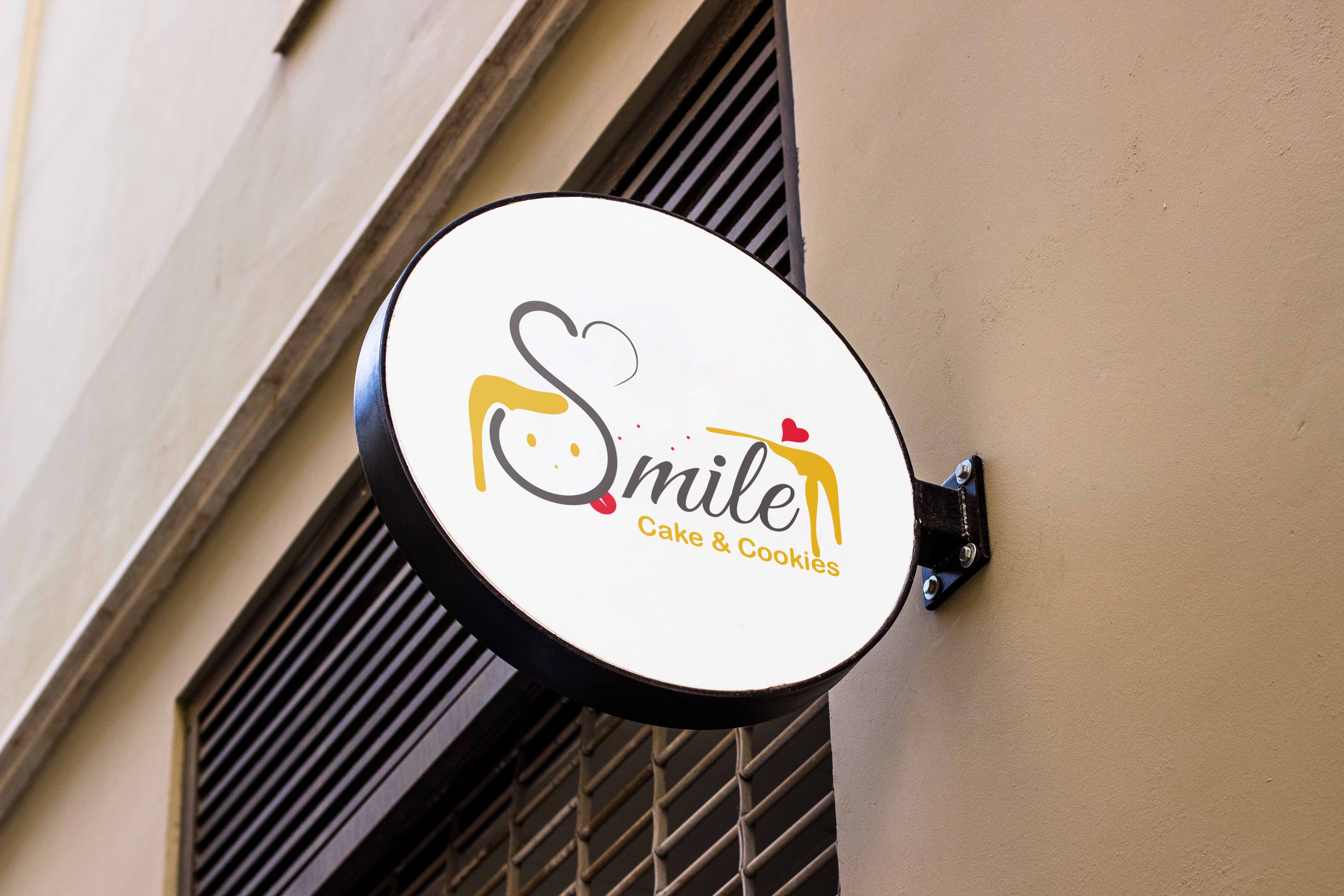
 I tried to make sure that you smile while looking at this identity. It is a clear visual appeal that represents the cake and cookie baker personality of the business owner.
The interplay between the colors sparks the same feeling of happiness. Each color pallete is created with a sense of evoking emotions since colors are major parts of emotion and a brand is better experessed when there is an emotion attached to it.
This harmonious fusion of elements in the logo conveys the hotel's core values of adventure, authenticity, and a deep respect for the natural beauty of the destination. The overall design evokes a sense of rugged, outdoor exploration - reflecting the hotel's commitment to providing an immersive, experiential stay for its guests.
Chief Creative Director at Brand It Trading PLC

Local Marketing Vendor fro Bethany Christian Services

Chief Designer for Kal Weekly ministry
You can email at any time or give me a call for any design requests or inputs on my previous works